

Shop Now
- Copic
-
Painting
- Paint
-
Inks
- Atelier Acrylic Inks
- Sakura Oil Printing Colours
-
Permaset Screenprinting Ink
-
Permaset Aqua Standard
- Permaset Aqua Standard 100ml
- Permaset Aqua Metallic 100ml
- Permaset Aqua Standard 300ml
- Permaset Aqua Glow 300ml
- Permaset Aqua Metallic 300ml
- Permaset Aqua Standard 1Lt
- Permaset Aqua Process Colours 1Lt
- Permaset Aqua Glow 1Lt
- Permaset Aqua Metallic 1Lt
- Permaset Aqua Standard 4Lt
- Permaset Aqua Process Colours 4Lt
- Permaset Aqua Glow 4Lt
- Permaset Aqua Metallic 4Lt
- Permaprint Premium
- Permaset Aqua Supercover
- Screenprinting Sets
- Print Paste
- Screenprinting Accessories
-
Permaset Aqua Standard
- Amsterdam Acrylic Inks
- Mediums
- Canvas and Surfaces
- Brushes and Tools
-
Drawing
- Markers
- Pens
- Pencils
- Pastels
- Inks
- Drawing Surfaces
- Accessories
- Surfaces
- MABEF Easels
- Craft & Cutting
- Adhesives & Tape
- Display & Storage
- Framing Supplies
- Monumental Masons
- Talens
- Tutorials
- X-Press It
- Acrylic Paint
- Acrylic Pouring
- Art
- Art Creations
- Australian Artist
- Blending
- Chroma
- Cobra Water Mixable Oil Colours
- Colour Mixing
- Copic
- Deco Tape
- Double Sided Tape
- Drawing
- Ecoline
- Fineliners
- Gel Pens
- Gelly Roll
- Hand Lettering
- Koi Watercolours
- Lightfastness
- Mixed Media
- Oil Painting
- Oil Pastels
- Paint Markers
- Painting
- Pastels
- Pencils
- Permanent Markers
- Pigma Micron
- Pouring Art
- Rembrandt
- Sakura
- Soft Pastels
- Solvent Free Oil Painting
- Step By Step Tutorials
- Storage
- Talens
- Tips & Techniques
- Van Gogh
- Watercolour Brush Pens
- Watercolours
- X-Press It Craft
- Metal Leaf
- Glue
- Adhesives
- Alcohol Markers
- Copic Sketch
- Copic Classic
- Copic Ciao
- Copic Ink
- Airbrushing
- Refillable
- Alcohol Ink Art Techniques
What Copic colours should I choose?
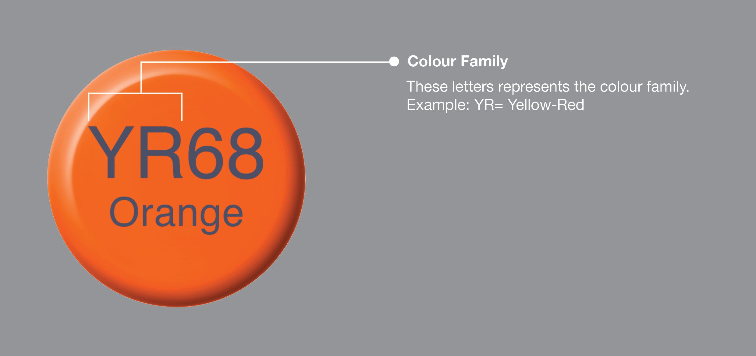
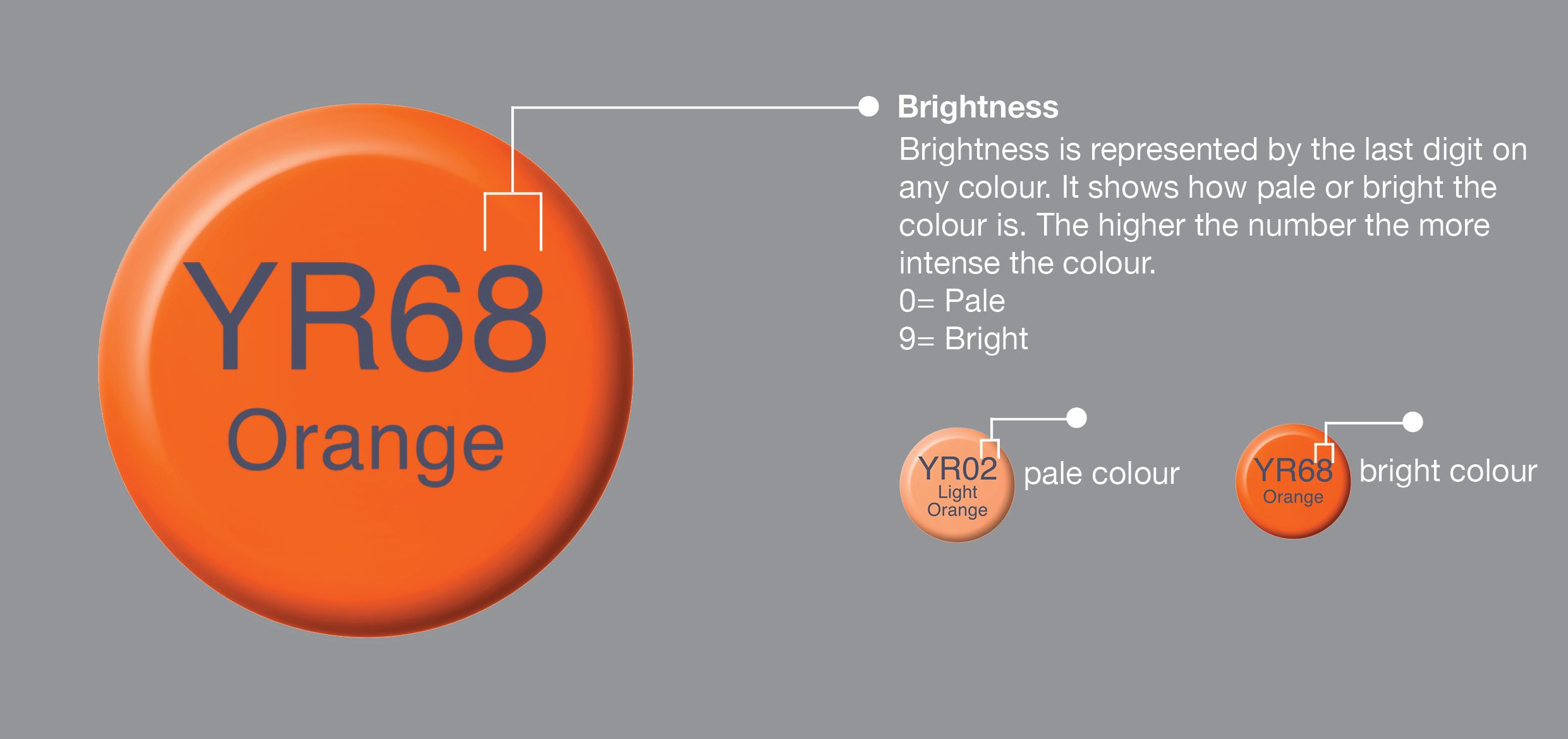
The numbers and letters on your Copic Markers represent classifications within the Copic Colour System (colour family, saturation & brightness). These classifications help you pick colours that will work well together.
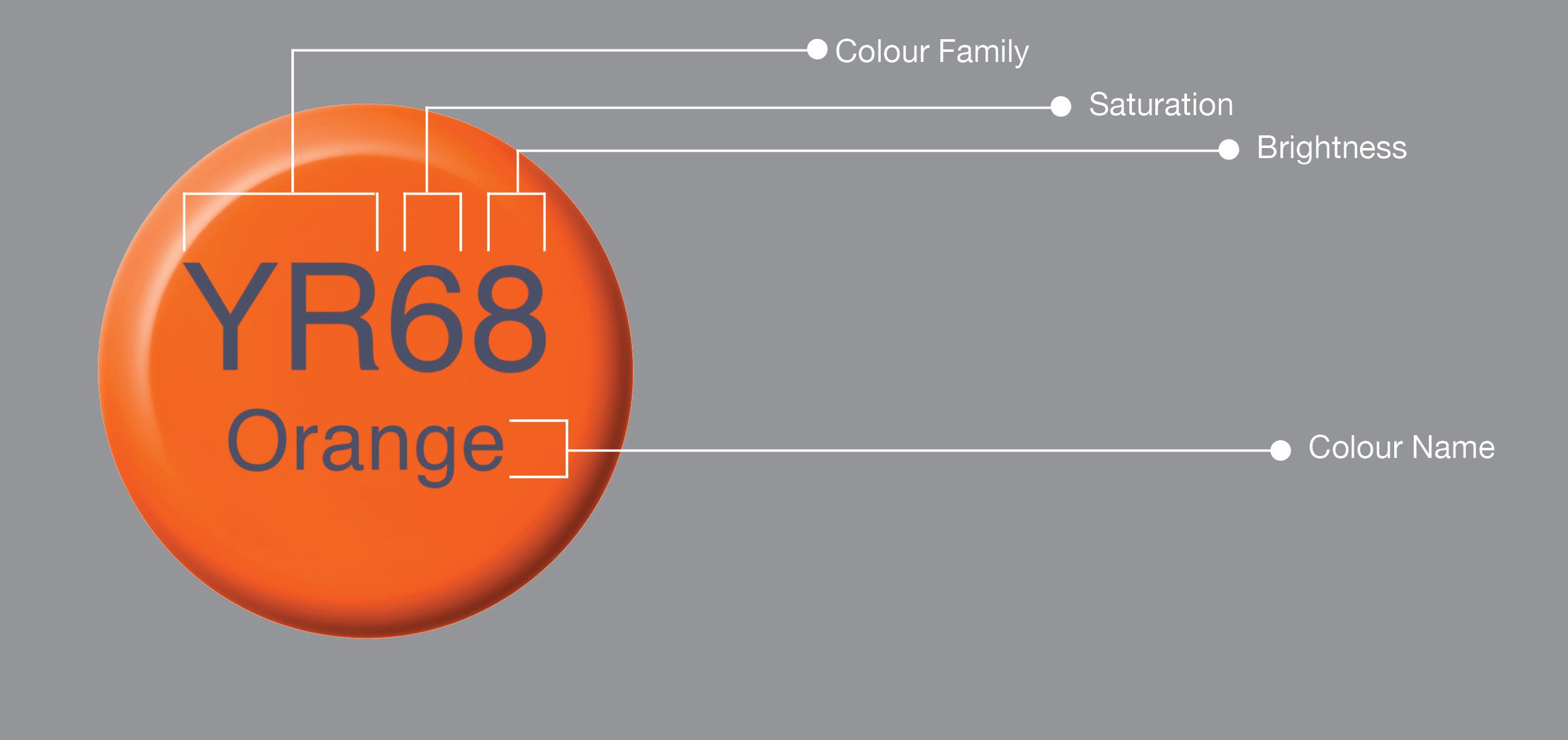
Use the classifications of the colour family, saturation and brightness to choose colours that naturally blend by following these rules:
1. Match the colour letters by keeping the colour family the same
2. Match the colour saturation number keeping the tone the same
3. Pick the colour brightness numbers within 2 or 3 digits of each other
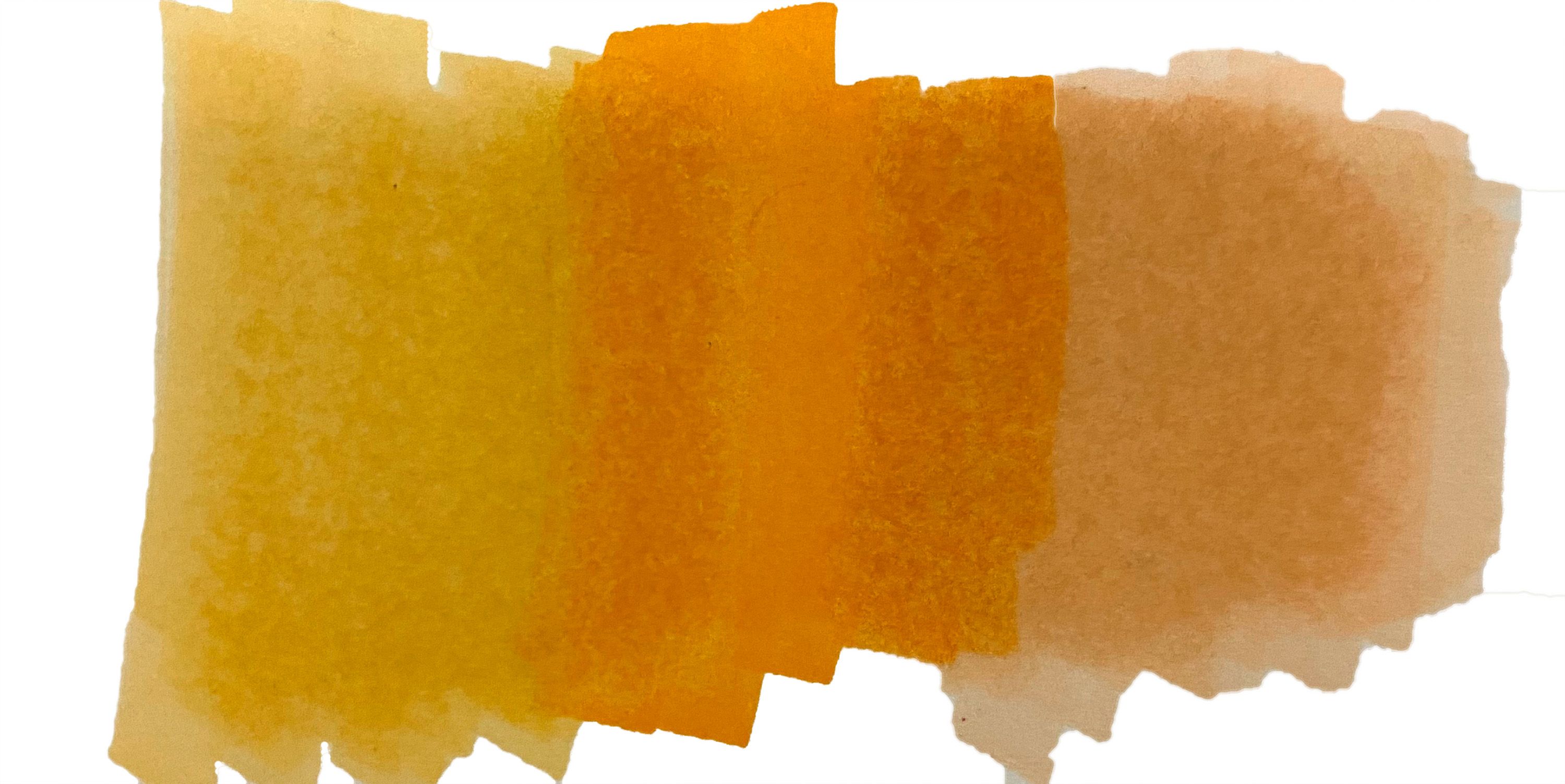
Example: The below image uses YR04, YR07 and YR09. Have a look to see how easily these colours blend.
Example: The below image uses YR00, YR16 and YR21. These colours are from the same colour family but have different saturation numbers therefore the tones in the colours are different. They also have different colour brightness and when trying to blend these colours you can see when one colour ends and the other starts.

For smooth blending always try to purchase markers in groups of two or three, with varying degrees of brightness. For example B00, B02 and B04
Click Here to view the Copic Colour wheel
Please note: Printed Colours VS. Actual Colours
Printed colour charts are for reference only. To know what your Copic colours look like you will need to create an actual colour swatch. The Copic swatch book is available from your local Copic Supplier. This is also a great way to keep track of what Copic colours you have in your collection.